Project 01
Design System
Establishing the Company’s First Design System & Guidelines
Sole lead UX Designer | Figma | 2023 - Present
When I joined, Adobe XD was the only design tool in use and there was no shared library, no tokens, and no documentation. Each product had evolved independently — with its own colour palette, its own spacing conventions, and its own component patterns that existed only in the designer's head. There was no single source of truth, which meant every new feature meant starting from scratch and every product felt slightly different from the last.This wasn't just a visual problem — it was a scaling problem. As the team and product grew, the fragmentation would only compound.
Visually fragmented
Disconnected experience
No single source of truth
Style fragmentation across products
Goals & Objectives
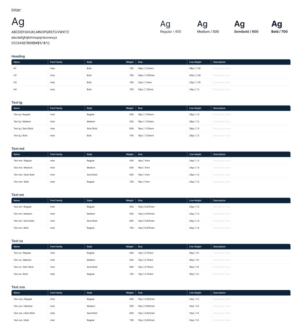
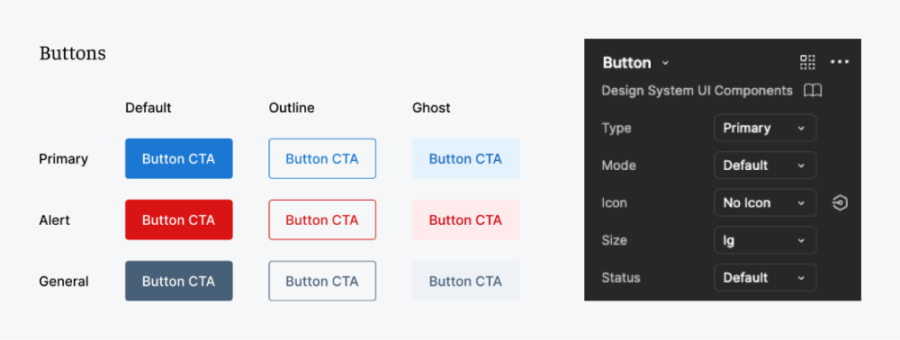
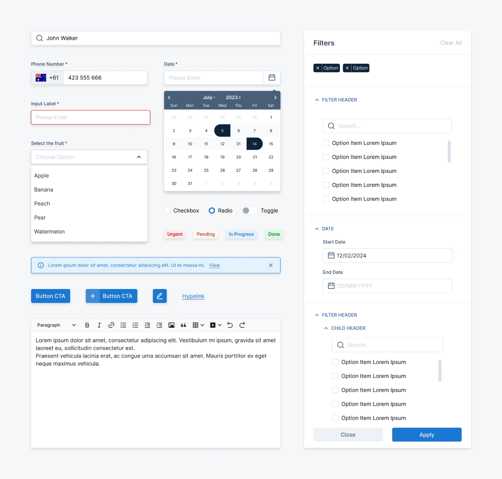
I aimed to create a scalable, reusable, and accessible design library. Beyond ensuring UI consistency across projects, keened to enhance collaboration among designers and streamline the handoff to developers.
Research Preparation
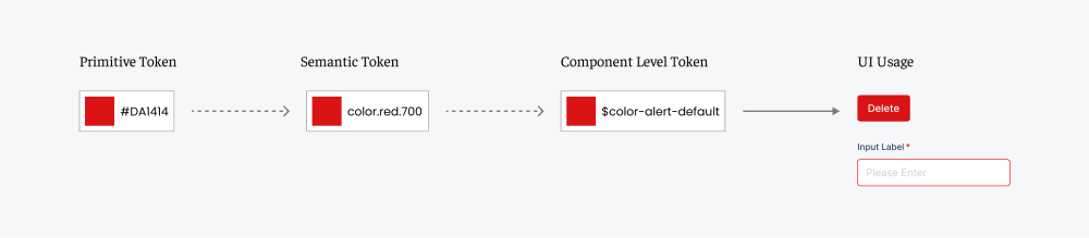
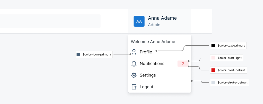
Before building anything, I approached research from two directions — looking outward at industry best practices, and inward at our own design reality.External: Studying Material Design and Atlassian's system surfaced a critical insight: tokens should come before components. Without a token foundation, any component library becomes rigid and hard to maintain.Internal: Auditing our existing product files told a different story. With Adobe XD as the only tool and no shared library in place, every designer was building in isolation — inconsistent spacing, mismatched colours, and zero documentation meant no two products spoke the same visual language.These two inputs together determined what to build first, how to structure the library, and how to bake accessibility in from the start — rather than retrofitting it later.

To build the components and elements, I’ve focused on establishing the backbone of the design system, such as color, typography, spacing, and radius. By mapping these elements into tokens and variables, we can ensure the components are designed in the future with a certain degree of uniformity while also containing flexibility. Both tokens and variables in the system can be used as the only ‘Bible’ across future projects.
Rather than building a distinctive brand palette from the start, I deliberately chose a neutral base. The reasoning was practical: the system needed to support white-labelling down the line, meaning any client could apply their own brand on top without fighting the defaults. Colour tokens were then organised into semantic groups — primary, surface, feedback — so swapping a brand simply means updating the token values, not rebuilding components.


To ensure the typography remains readable and adaptable across different scenarios or devices, I started by choosing a clean and versatile typeface that could fit a wide range of use cases. Rather than over-customizing too early, I focused on building a solid foundation that balances clarity and flexibility. From there, I defined key details such as font sizes, weights, and hierarchy levels to create a consistent typographic rhythm that can easily scale as the system grows.

With Figma’s powerful component features, configuring and managing variations has become effortless. Designers can now easily tweak components and access the right variations through the panel. This approach also makes onboarding smoother, allowing new team members to quickly grasp how each component is structured and used.

To validate the design system’s feasibility, I gradually integrated its components into real projects, using iterative testing to identify issues and refine variants. I collaborated closely with developers to ensure smooth integration and created detailed documentation to support adoption. Regular reviews, training sessions, and workshops helped align both designers and developers with the latest updates.

The system launched and was adopted across multiple products — moving the team from isolated Adobe XD files to a shared Figma library used by both designers and developers.
This project shifted my thinking from designing screens to architecting foundations others build on top of.The hardest part wasn't technical — getting developer adoption was more challenging than building the system itself. That pushed me to invest as much in documentation and communication as in the components.It also taught me that flexibility and consistency are in constant tension. Too rigid and the system becomes a bottleneck; too flexible and it stops being a system. Finding that balance is an ongoing design problem, not a one-time decision.
Always keen to explore the world, let’s connect 🧩
kaho.c.design@gmail.com