Challenge & Solution
Reconciling Legacy Logic & User Habits
The Human Factor: The Friction of Change
Challenge
Existing features were "islands" built by different teams at different times. While users complained about the old system’s clunkiness, they had developed "muscle memory" for its quirks. The challenge wasn't just designing a better workflow; it was navigating the friction of breaking old habits without causing "change shock" or a drop in productivity.
🔎 My Strategy:
I audited every conflicting workflow to find a "Universal Logic." To minimize "change shock," I identified Anchor Points—keeping the mental model of core tasks consistent while streamlining the steps to make the efficiency gains immediately obvious.
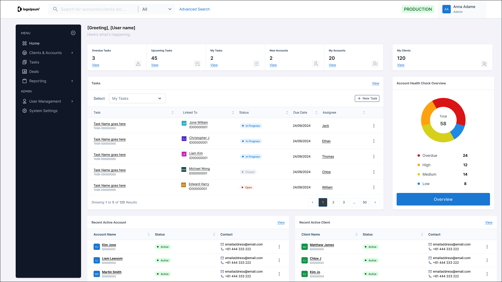
To unify the experience, I identified core actions that appeared across every module and established a Universal Pattern Language:
Standardizing Triggers:
I moved all primary actions (Create, Edit, Export) to consistent "Anchor Points" in the UI. Users no longer had to "hunt" for the button—their eyes knew exactly where to go, regardless of the module.
The "Contextual Drawer" Pattern:
I replaced full-page redirects and inconsistent pop-ups with a unified Side-Drawer for editing. This allowed users to maintain their place in the "Main List" (keeping their context) while performing tasks, significantly reducing cognitive load.
Preserving Mental Models:
Where a legacy workflow was deeply ingrained, I kept the logic of the step but cleaned up the interaction. I simplified the path to the goal without moving the "goalposts," making the transition feel like an upgrade rather than a total replacement.


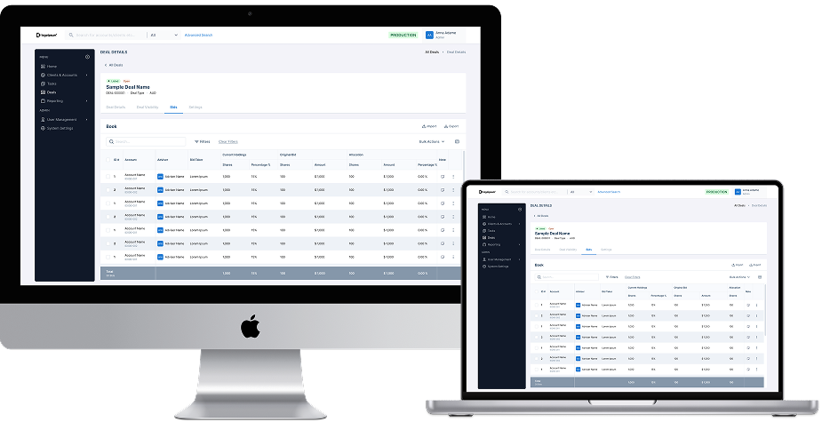
Account Page Sample

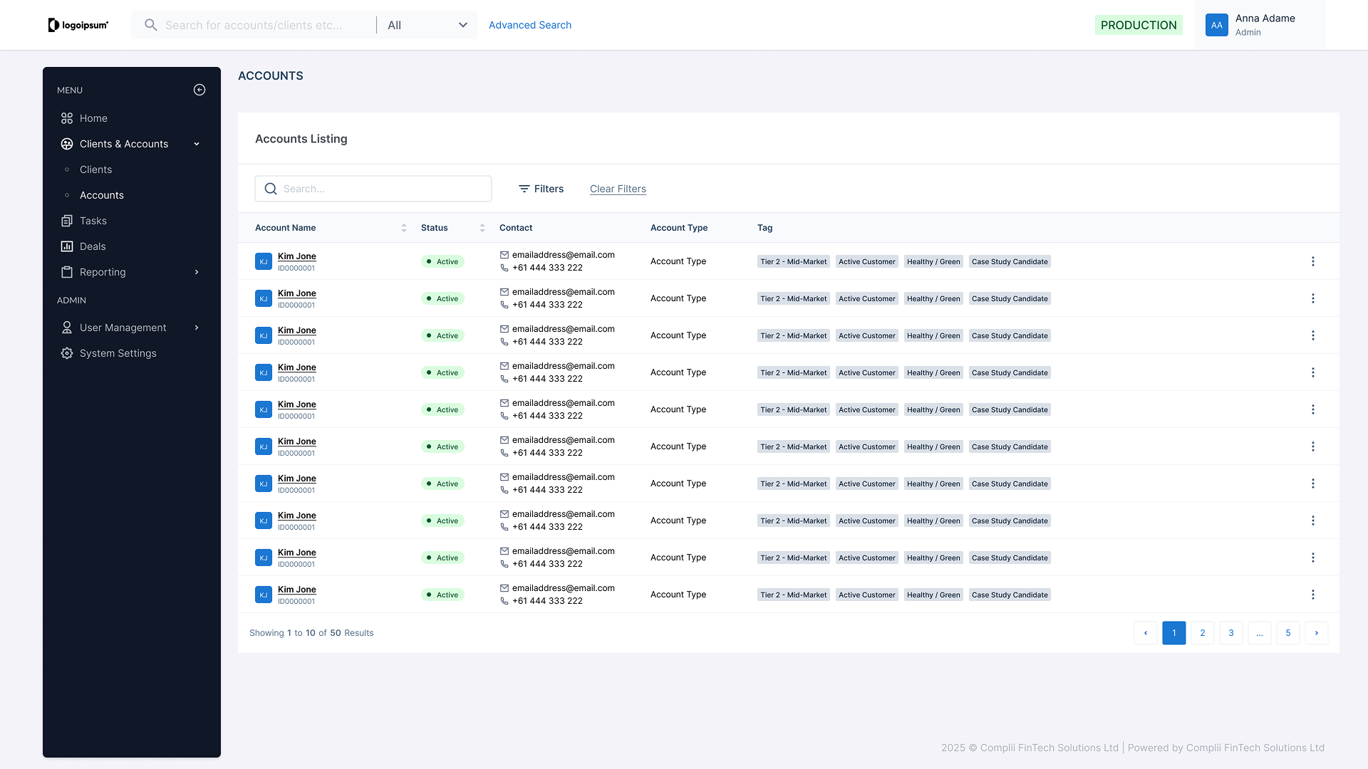
Deal Page Sample
The Result
By reconciling these "islands" into a single logic, we eliminated the learning curve for new features. Initial feedback showed that legacy users could navigate the new V2 environment with minimal training because the system now "spoke one language."
Architectural Foresight
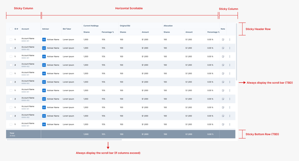
Case Sample - Rich Data Table
Challenge
A common pitfall in CRM development is the "Delete and Rebuild" cycle, where adding a new module forces a total redesign of the old ones. The System Goal: I needed to design for the unknown.
🔎 My Strategy:
I treated the CRM as a modular ecosystem. By building a library of Atomic Components, I ensured the foundation was rigid enough to maintain order, but flexible enough to "plug and play" future V3 and V4 features without requiring a code overhaul.
Instead of designing a static table every time, I broke the table down into "Atomic" parts that could be toggled on or off based on the business requirement. To break down:
The Cell Level (Atoms)
I created a component set of "Cell Types"—Status Badges, Avatars, Contacts, and etc.
The Row Level (Molecules)
I defined standardized behaviors for hover states, selection, and "Quick Actions" so the interaction logic never changes, regardless of the data.
The Table Level (Organism):
I built in "Global Utilities" like sort, scroll action, and bulk actions as optional plugins.

The Result
This atomic approach transformed the data table from a static element into a dynamic framework, allowing for rapid assembly to meet any business requirement. By standardizing behaviors—such as sticky columns and fluid scroll actions—the system ensures data remains readable and functional across all screen sizes, from desktop to mobile.
System Synthesis
Translating Complexity into Clarity
Challenge
In a CRM of this scale, requirements never exist in a vacuum; a change in one module creates a ripple effect across the entire system. While the BA team provided the technical data maps, the challenge was to synthesize "tons" of interdependent requirements into a single, cohesive interface. If I missed a single connection at the start, the foundation would be flawed for the user.
🔎 My Strategy:
My role was to act as the bridge between backend logic and frontend mental models before moving to hi-fi design. I acted as a Systems Architect. I mapped out the dependencies between "tons" of requirements to ensure the core structure could support every edge case.
I focused on three key areas to ensure the system remained intuitive despite its scale:
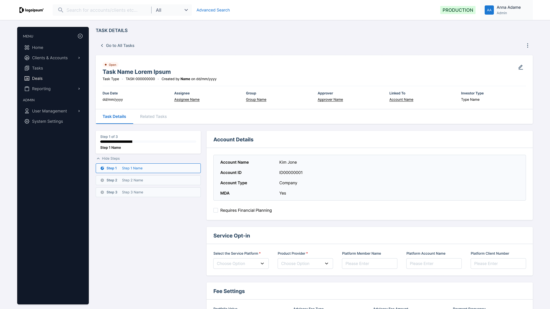
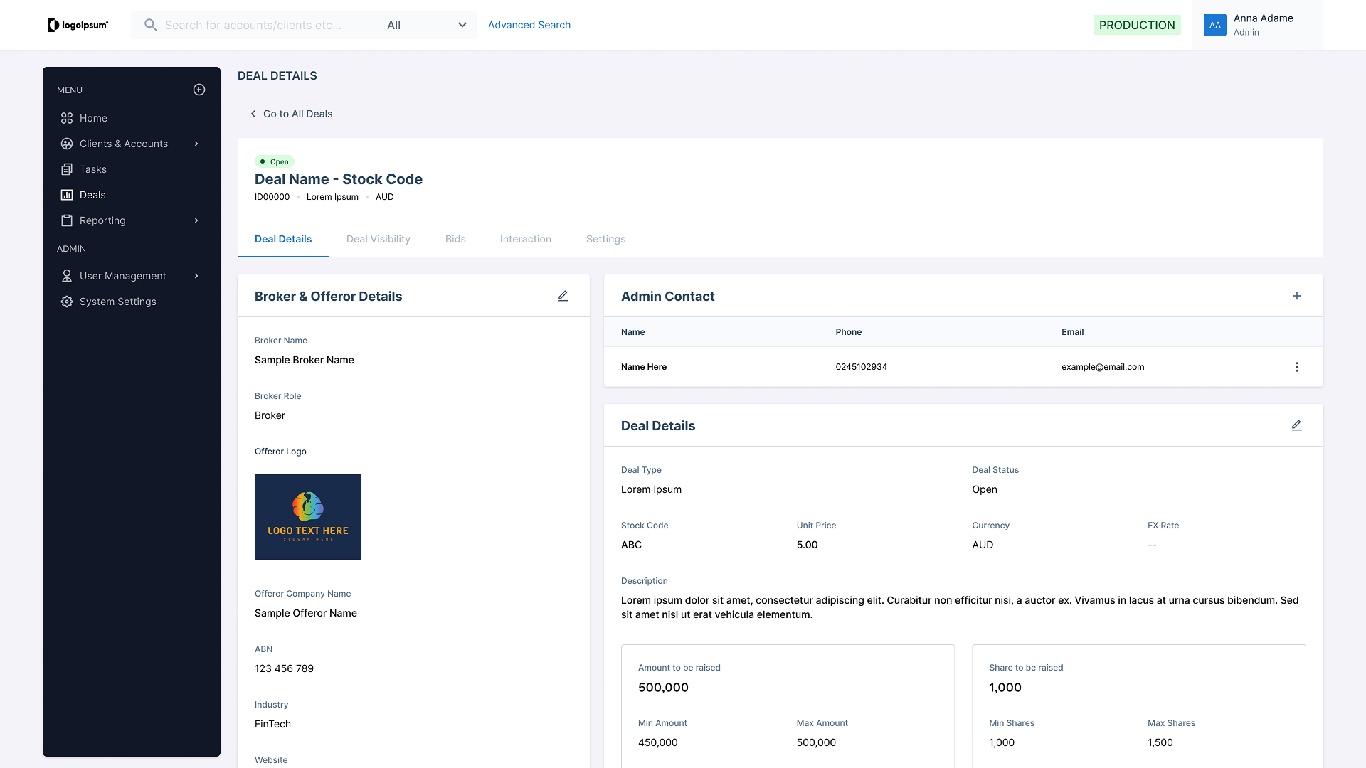
Requirement Synthesis
I deconstructed the BA’s technical requirements to identify "invisible threads"—connections between data points that users needed to see but were currently hidden in silos. In addition, by mapping the item into screen information architecture to illustrate how details could be presented into actual screen which prevent cognitive overload while actual design in the later stage.
Predictable Continuity
I established a "Universal Thread" across modules. No matter how deep a user dives into the CRM, the way "Connected Entities" are presented remains identical, ensuring they never hit a logic dead-end.


The Result
By translating technical requirements into a functional hierarchy, I ensured the system was not just data-accurate, but operationally intuitive. I turned a complex web of requirements into a clear, navigable ecosystem that guides the user through the "noise."